From Arthur’s Seat
I designed the book jacket and typeset the manuscript for the University of Edinburgh’s annual creative writing anthology, published in partnership with Egg Box Publishing. The anthology brings together work from writers from around the world who came to Edinburgh to study creative writing.
Alongside the publication itself, I developed a visual identity for the anthology and carried it across social media campaigns and other branded materials used to promote the publication.

Bookcover
The cover was inspired by postcards, reflecting the anthology’s international group of writers who came together to study at the University of Edinburgh. The handwritten back-cover blurb, written by one of our contributors, acts as a personal “note” from the writers to their readers.
The stamp featured on the back cover and spine draws from the From Arthur’s Seat logo, itself inspired by St Giles’ Cathedral.
The cathedral’s cupola frames the Edinburgh sunset.
The color palette references CMYK, celebrating both the printed word and the physical process of putting the anthology to paper.


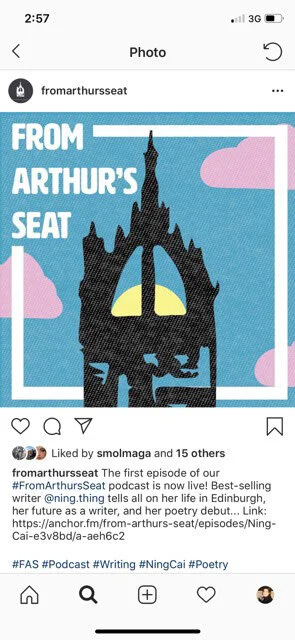
Social Media Graphics
As part of the anthology’s promotional campaign, I developed a series of social media graphics to build awareness and engagement around the publication. The campaign extended the anthology’s visual identity into digital content, maintaining a consistent use of typography, color, and graphic elements across each post.
The graphics were created to support different stages of the publication, from announcing the first successful print run to promoting the accompanying podcast and celebrating the work of its contributors.

Gin Label
For the release party of the anthology, author Russell Jones created an infused gin using ingredients that represented our diverse cohort. I designed the label following the branding guideline for the anthology.
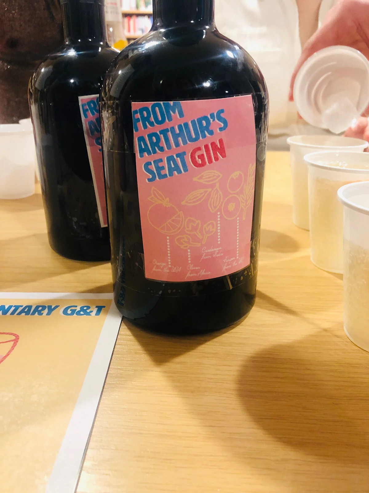
Gin in Action
It made a mean G&T which was handed out with each sold copy of the anthology.